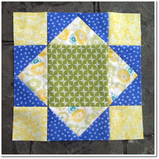
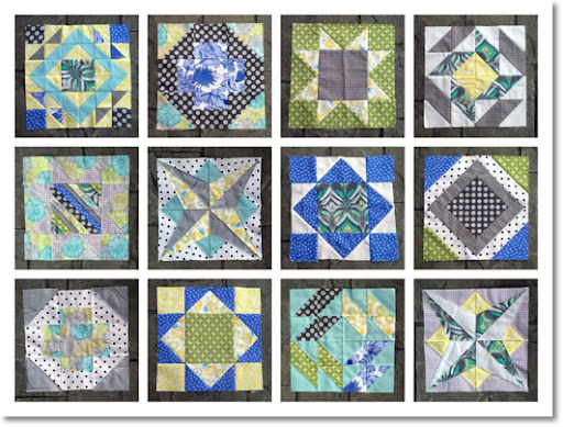
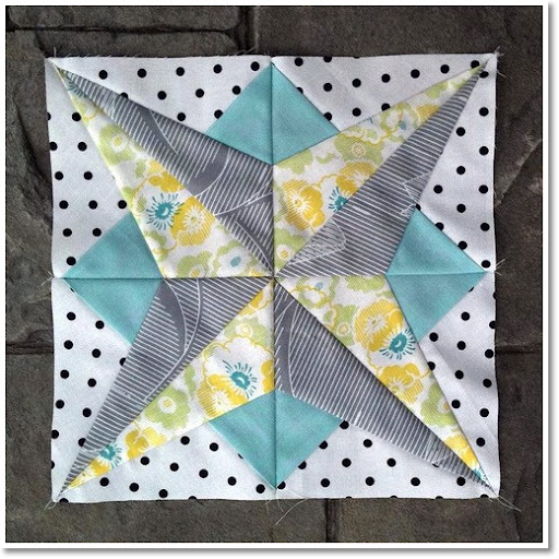
Finished up the last two blocks I needed for my Summer Sampler Series quilt. I only made five of the twelve blocks from the QAL. Add in my oops version of this one and that's six blocks, which I doubled up on to make twelve.
 |
| "oops" Star of Virginia |
At one point I thought I'd do a much bigger quilt including the other skipped blocks, but I'm calling it quits now because I've run out of my original prints and simply want to finish some things before I make any more trips to the fabric store.
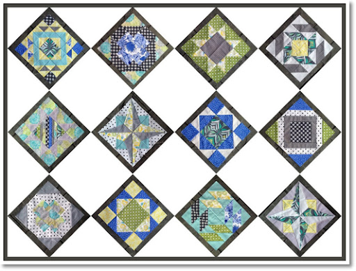
Now I'm left trying to decide on a layout...
 |
| layout option 1 |
 |
| layout option 2 |
The blocks are all slightly varied in size due to my not so consistent seam allowances and general quilting naivety, so I'm bordering each block with a slate print and squaring them up all even and whatnot. After that I'll either sash them in white or put them on point.
Which would you do? I would love suggestions :D
Joining the linky parties over at Sew Many Ways, Petite Hermine, I {heart} Naptime, Flamingo Toes, Canoe Ridge Creations, Quilt Story and (upon personal request, oh my!) Sweet Little Gals. Go check them out, you won't regret it!


Hard one - but I do like the full on drama of no 1 just a little bit more. If the alternate square in no 2 were grey not white I might like it better! Just a suggestion...
ReplyDeleteGreat looking blocks and that was a good idea to border them in slate to even them up. Either design looks good, it just depends on how much quilting you want to do.
ReplyDeleteFirst of all, it's amazing how hard it is to tell that you only made 6 different blocks! Very cool! And for the layout I think I like the 2nd one better but I guess you would really have to focus on the quilting then. Do you know what i mean?
ReplyDeleteGreat job! Go on point....even though it is tricky for me that is. I'm signed up to follow you!
ReplyDeleteI like the on point option just a bit better. I love all of the different blocks!
ReplyDeleteI vote layout 1. I think it showcases the blocks more. The mix of the prints are great! Maybe layout 2 with a great little something quilted in the solids block?
ReplyDeleteI like option 1, and I love the star block! What a great idea to lay out your blocks on the computer!
ReplyDeleteLOVE your summer sampler! Personally, I prefer option 1. IMHO, I just think #2 dilutes the overall effect of all the beautiful color. Either way it will be just lovely though! (I still look at mine and just smile....)
ReplyDeleteThey're beautiful! Thanks so much for sharing! Have a marvelous day! :)
ReplyDeleteThose are great blocks. I just like a nice straight layout to really let the blocks shine.
ReplyDeleteGreat blocks! I like simple--so my vote is for option 1. :) Thanks for linking up to {Sew} Modern Monday and have a great week!
ReplyDeleteYour blocks look so lovely Krista - I would love to do this sampler quilt one day too!
ReplyDeleteI laughed when I read your caption about your Star of Virginia block. I've ripped out more than one of those backward strips and resewed them, but I like how yours turned out. I am always a sucker for mashing up blocks next to each and watch them play side by side. But I have to admit, the pristine isolation of the diamond set also does them well--and your quilt will be bigger.
ReplyDeleteBut if I have to chose just one: straight set. Love those blocks!
Elizabeth E.
occasionalpiece.wordpress.com
Hi, if I were you id use the Quilt Dreams iPhone App to plan out your quilt. You basically just take a picture of each square and you can easily move them around on a grid until you figure out how you want it.
ReplyDeleteI REALLY like layout #2. It's so unique, I don't think I"ve seen anyone else do it that way.
ReplyDelete